Edit Stop View
Update the UI to make it quicker for drivers to enter stop details, motivating them to do it more often.
Problem
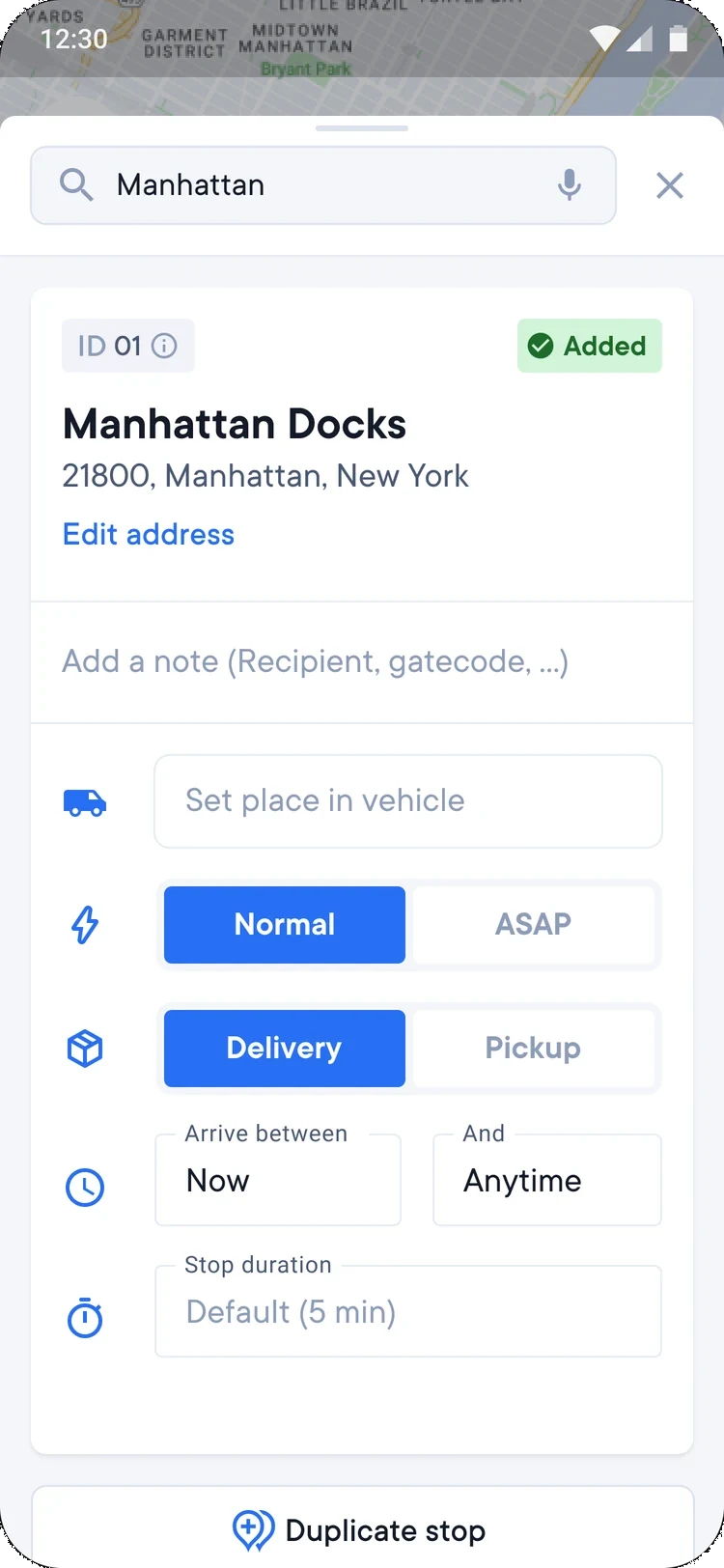
The old edit stop view was a different experience on each platform, so the same task looked and worked differently on Android and on iOS.
- Different experience on each platform
- Not optimized for vertical space, to reduce the need of scroll
- Outdated components
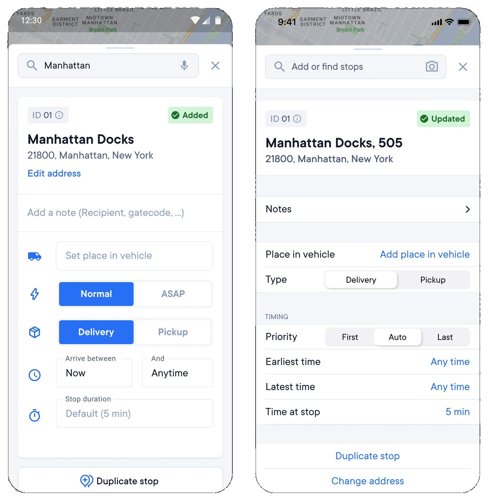
Redesign
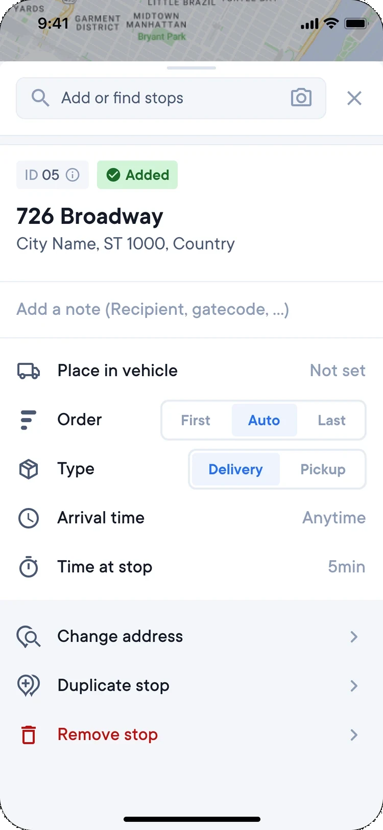
The stop details became a compact list: place in vehicle, order, type, arrival time and time at stop, with change address, duplicate stop and remove stop below it. It fits more on one screen, so there is less to scroll.